

Cumulative Layout Shift, or CLS, is a measure of how much a webpage shifts unexpectedly. It is a user experience metric that helps us understand how frustrating a page is. Think of the last recipe you were trying to read - you’re a few paragraphs in, and suddenly you lose your place because ads popped in above where you were reading. Or, more importantly for ecommerce, you’re trying to add a product to cart but suddenly the button moves down and you click on the wrong thing which directs you somewhere else. It’s very frustrating! It can lead to higher bounce rates and fewer conversions.
Our job is to help merchants improve their web performance and apply learnings back to our platform. In our experience, we’ve observed the same common CLS issues across most Shopify sites. In this article, I will cover each of these issues with tips or resources for how to fix them:
- Not saving space for images
- Not saving space for injected content
- Late-arriving CSS
- Incorrect animations
- Font swapping
The first three are the most common issues. I’ve added the last two in case you’ve already fixed the first three and are still struggling with CLS. At the end of this article, I’ve included how to measure and detect Cumulative Layout Shift.
1. Save space for images Jump to heading
When a browser first renders a page, it does not know the dimensions of an image unless it is provided in the HTML or CSS. It will render the page acting as if the height of the image is zero. When the image finally loads, it will then realize what the height is and shift content down to accommodate the image.
The most common fix for this is to set height and width attributes on your <img> tag with your CSS declaring 100% width (or max-width) and auto hight:
If you’re building a theme or design system from scratch, it’s best to have this base CSS set for all images at the start of your project and then to manually adjust the styles of any special images.
To get the height and width on your images, the easiest method is to use the Liquid image_tag. It will automatically add the dimensions to your HTML:
Another method to approach this problem is to use the CSS aspect-ratio property which we cover in our article about Optimizing images for performance.
Sometimes, you want to fill and crop an image to set dimensions instead - often when you’re trying to bring a CSS background image using “cover” into the markup as an <img> tag. In those cases, you can set the dimensions on the imagecontainer using CSS. Then, use the newer object-fit property to have the image “cover” the space. See the MDN documentation for more information.
2. Save space for injected content Jump to heading

Shopify sites will frequently use apps or third parties to add additional features such as promotional announcement banners, payment alternatives, and inventory levels from external data. Many of these apps do not save space for the content they inject on the page. They are loaded using JavaScript so they arrive after the page has started rendering. Similar to our images issue from above, the browser then has to shift content down or to the side to accommodate the new content.
The solution to this is to save space for the content, but the specific method will vary based on your situation. Generally speaking, use CSS to set height and/or width. You may have to add a container (for example, a <div>) for the injected content and then apply the styles to the contaner. If the height is variable, you can set it to the most common or at least minimum height. It won’t fix all your use cases, but it will reduce the total CLS which is still an improvement in user experience.
Rockey Nebhwani is a web developer and web performance expert who has spent a lot of time optimizing the Rothy's website. He submitted this solution for setting a min-height on app blocks using Custom CSS. For example:

.shopify-app-block as a selector./* This generic selector will target app blocks. */
.shopify-app-block {
min-height: 23px;
}You can also re-evaluate your design. For example, you could move injected content next to static content that has an equal or larger height with nothing to the right of the injected content. It will load and render per usual, but nothing else on the page will shift. This is the goal of CLS - to have nothing else be shifted by an element.
What do you do when an app injects content without using app blocks? Unfortunately, that's a bit harder to fix and even less easy to maintain. I installed Trustpilot in my test store to explore this option. They do not use app blocks yet, and everything is injected using the deprecated ScriptTags API:

To fix this, I needed to use two features in CSS - the next-sibling combinator and the :not() pseudo-class. The following CSS says if an element which is not the Trustpilot widget comes before the product description, set the top margin to this (higher number):
:not(#trustpilot-widget-trustbox-0-wrapper) + .product__description {
  margin-top: 77px;
}
This is pretty hacky. If I ever moved the widget to a different location, I'd need to remove or modify this so that the product description would not have an odd gap above it. So it's not maintainable. It would be better to use an app that uses app blocks instead. The only other way to reduce the impact of this is to position widgets like this closer to the bottom of the screen or even better yet, below the fold.
Outside of apps and third parties, if your theme uses a frontend framework like Vue or React, you may have large CLS scores due to components rendering late, for example after data has arrived. Longer term, consider an architecture change to HTML-first as frontend frameworks paired with Liquid storefronts usually suffer from many web performance issues. In the shorter term, you can convert sections above the fold to HTML-first and use CSS to reserve space for late rendered components.
3. Don’t lazy load CSS, especially above the fold Jump to heading

A common pattern in Shopify themes is to break up some of the CSS into section-specific files, then within the section, add the CSS link. However, many of these links use an async or lazy loading pattern that looks like this:
Browsers treat CSS as render-blocking because flashes of unstyled or semi-styled content result in a poor experience. It usually causes a layout shift as well. To learn more about how this works, read How layout position impacts three big web performance levers.
For this issue, first test whether using the async/lazy CSS pattern helps your performance using a tool like WebPageTest in combination with real user data. You may be able to simplify your code by removing the pattern and simplifying your code to:
If you want to keep this pattern, then only apply it to sections below the fold using the new Liquid section.index feature:
Read more about it in Announcing new Liquid features for better web performance.
4. Optimize your animations Jump to heading

Older methods of animating content frequently target CSS position attributes like top and bottom. This causes every animation frame to be treated as a layout shift. Instead, you should use the newer CSS transform: translateY(-100%) or similar translations (MDN docs). This newer method of animation is also hardware accelerated which means it can also improve other aspects of performance like laggy scrolls and delays in user interaction.
5. Use better fallback fonts Jump to heading

If you’re in the rare group where you’ve optimized all the other layout shifts and/or your font swapping is causing the largest part of your CLS score, then consider using a better fallback font. This is easier to do with custom themes but will be more difficult in themes built for the theme store.
With the new font descriptors (f-descriptors) available in CSS, customizing your fallback font to more closely match your brand or web font is now possible without using JavaScript. The Improved fallback fonts article has some great graphics that visually show what each f-descriptor modifies. It also has tips for better understanding size-adjust versus the other descriptors of line-gap-override, ascent-override, and descent-override. In short, your CSS would look something like this if you customize your fallback font:
This code sample comes from Brian Louis Ramirez’s great fallback font generator tool. If you have trouble uploading your font there, you can first modify your CSS to the above in your codebase, then use Dev Tools to manually adjust them.
How to measure and detect layout shifts Jump to heading
Now that you know the most common causes for poor CLS and how to fix them, how would you even find and debug them? I use two primary tools, Dev Tools and WebPageTest, which I will describe here. The Web Vitals Chrome extension is also a great tool - it can output layout shift details to the browser’s console. Finally, as mentioned at the beginning of this article, PageSpeed Insights can also be helpful if you filter for CLS issues then expand each of the audit results.
Use Dev Tools for a quick check of shifting content Jump to heading

I like to use Dev Tools to quickly understand what layout shift might be happening with the naked eye. This will miss “hidden shifts” and more complex issues, but can often find the bulk of your problems.
You’re likely testing your site on a fast computer with a fast network speed. Your experience will not be like how most users experience the site - on mobile devices with slower compute and network speeds. Thus, you’ll want to both disable the cache and emulate a much slower network speed. You can do both on the Network tab. Then you can refresh the page several times, looking for any layout shifts.
Use WebPageTest to map each layout shift Jump to heading
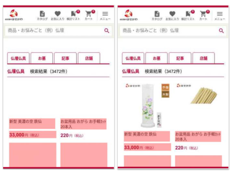
I use WebPageTest to catch all the layout shifts that I might have missed with the naked eye. This will also catch layout shifts caused by animating content incorrectly. Run your test then navigate to the Web Vitals view. In the CLS section, you will now see every frame that had a layout shift. The content that was shifted is highlighted in pink (not the elements that caused the shift). When you move your mouse over and off the image, you’ll see the before and after frames.

Conclusion Jump to heading
Layout shifts lead to user frustration and potentially lower conversions. When it comes to Shopify sites, poor CLS scores usually come from a handful of issues. To optimize for CLS, make sure that you save space for images and injected content, and don’t lazy load your CSS. If those three things don’t fix most of your issues, take a look at optimizing your animations and customizing your fallback fonts.
Cover photo by Matúš Kovačovský on Unsplash