

Updated: 18 Sept 2023
We help Shopify merchants improve their web performance and see three common problems related to layout position:
- Lazy loading images above the fold
- Asynchronous loading of CSS needed for elements above the fold
- Not prioritizing the fetch of the the Largest Contentful Paint (LCP) image
Historically, these three issues have been difficult to solve in Shopify themes, so we created some new features to help. This post will help you better understand these performance antipatterns so that you’re ready to use the new features.
What is image lazy loading? Jump to heading
Lazy loading of images is a web performance pattern to help prevent the unnecessary download of files that may not be needed. This helps reduce total bytes downloaded. It also frees the browser to better prioritize more important assets needed for initial render. The opposite of "lazy" loading is "eager" loading. Eager loading is the default behavior for browsers that encounter an <img> tag.
In the case of images, there are two ways to lazy load images:
- Using the native
loadingattribute:<img src="image.jpg" loading="lazy" /> - Using a library like lazysizes:
<script src="lazysizes.min.js" async=""></script>
<img data-src="image.jpg" class="lazyload" />
Both methods use the IntersectionObserver to observe when an image is close to "intersecting" with the viewport before loading it. This is great for images that are "below the fold" or hidden off screen. The problem comes in when the image is in the viewport on load. The browser will not load the file until after it performs layout and paint. Only then can JavaScript calculate the intersections. This adds a significant delay versus the default eager loading behavior:

If you’ve decided to use lazy loading, you may be asking yourself which is the best method. The benefit of using native lazy loading is that it requires no extra JavaScript dependencies. With Interaction to Next Paint (INP) on the horizon as the next Core Web Vital, you’ll want to get your JavaScript dependencies as lean as possible.
Currently, the main benefit that tools like lazysizes have over the native solution is that they can automatically calculate the sizes attribute for lazy loaded images. The good news is that this has been proposed and accepted as a new feature in the HTML specification. Chrome is releasing a dev trial soon with Firefox and Safari indicating positive intent to ship, at the time of writing.
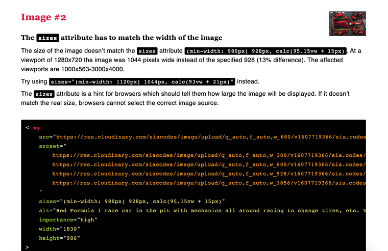
Unfortunately, for both methods, you need to set the sizes attribute manually for any image that needs to be eagerly loaded. The size cannot be calculated until after paint, leading to the same problem with delays as mentioned above. The sizes attribute is notoriously difficult to get correct. In these cases, the Responsive Image Linter Chrome extension can help you dial it in more accurately. Put in any "bad" value for the sizes attribute, and it will suggest a good value for you. The srcset suggestions can be a bit aggressive - you don’t need a perfectly sized image for every width. It’s faster to have a shorter list of widths to take advantage of caching.
sizes attribute for you.The impact of poor lazy loading on performance Jump to heading
Historically, theme developers have not been able to determine section order or position. This caused many themes to apply lazy loading to all images. The result is that 82% of Shopify sites now lazy load their Largest Contentful Paint (LCP) images.

This performance antipattern causes the LCP to be delayed by varying amounts, depending on device and network speeds. In this test for improving the Dawn theme last year, switching the article header image to eager instead of lazy loading improved performance by 0.5 seconds:

In addition, when looking at the broader web through HTTPArchive, the distribution of Shopify sites that lazy load their LCP element is slower than the eager-loaded distribution. The median LCP for the lazy loaded sites is 1.0 second slower than the eager loaded ones. When we go further along the tail, that difference increases to 1.4 seconds at the 75th percentile:

What is asynchronous CSS loading? Jump to heading
Async loading of CSS is a handy pattern considering Shopify themes often need more CSS for theme flexibility. It helps de-prioritize CSS that may not be needed right away. This pattern is closer to a hack than a feature; although it is a handy one. This is what the code typically looks like:
<link rel="stylesheet" href="my.css" media="print" onload="this.media='all'">
<noscript>
  <link rel="stylesheet" href="my.css">
</noscript>
How does it work? Browsers will only set the highest download priority for stylesheets that match the "screen" or "all" media attribute. If the media is set to "print", it will set the priority to "lowest". Other higher priority files will download first. Also, the initial render will not use the print styles. Then after the load event fires, JavaScript changes the media to "all" or "screen". At that point, the CSS file priority changes to "highest", and the page is re-rendered once the styles arrive. As a fallback for browsers where JavaScript is disabled, it’s a good idea to add in the standard <link> fallback within a <noscript> tag.
Here is what that process would look like using our simplified render diagram:

The impact of poor asynchronous CSS loading Jump to heading
We see many Shopify sites using this pattern causing layout shifts. This impacts Cumulative Layout Shift (CLS), another Core Web Vital. Stated another way, if elements above the fold need those styles, a user will see a flash-of-unstyled-content (FOUC), or what I like to call a flash-of-semi-styled-content. Let’s call it "FOSSC":
Style reflows due to late CSS can also destroy an otherwise perfectly crafted image lazy loading strategy. The IntersectionObserver might "wrongly" detect an image in the viewport only to have late CSS push that image further down the page. Injected components can also do this. The net effect could be that many images are loaded at once even if the final page layout should only have downloaded a few.
What is fetch priority? Jump to heading
Fetch priority is a more subtle concept. The number of files needed to show a website is high, thus smarter ordering of the files in the download queue can result in a faster perceived user experience. Browsers set download priorities based on different file types and contexts. For example, browsers fetch CSS files at the highest priority because they are render-blocking and needed for initial render.
By default, images are fetched at a low priority. Once a browser determines an image is visible and needed sooner than offscreen images, it can change the fetch priority to high:

The Fetch Priority API allows us to hint to the browser that we’d like a different priority set for an asset. For example, if we’re almost certain a particular image element will be the LCP element, we can set its priority to high:
<img src="LCPimage.jpg" fetchpriority="high" alt="Important image!">On the other hand, if we know an asset is not important, we can set its priority to low so that other more important files can download sooner.
Don’t go wild with this feature! If everything is important, then nothing is important, and we’ve made the browser less optimal than its default behavior.
The impact of poor fetch prioritization Jump to heading
In most cases, the impact is a missed opportunity of not getting your LCP image fetched at a high priority from the start. This is about a 0.3s improvement (conservatively) left on the table.
On the other hand, you may use prioritization poorly by setting too many assets with fetchpriority="high". This could de-optimize the loading prioritizations, delaying both FCP and LCP.
Help is here Jump to heading
We now have some new features for Liquid storefronts to better cope with these issues:
-
Default lazy loading for the
image_tagfor sections further down the page -
New section properties
section.index,section.index0, andsection.locationfor more fine-tuning of image lazy loading as well as async CSS loading.
Check out Announcing new Liquid features for better web performance to learn all about how they work and to see code samples.
Cover photo by Hal Gatewood on Unsplash