

Updated: 18 September 2023
Responsive images are important for both user experience and site speed. Get them right, and your users will be more likely to convert. Get them wrong, and you may cause your site to be slow.
Getting images right has always been a struggle. We get new features, formats, and strategies each year, making it hard to keep up with the latest best practices.
In this post, I'll give you the current best practices for balancing speed and quality when it comes to images. I'll cover:
- The core concepts of responsive, optimized images on the web
- How to optimize your images for a Shopify storefront using the Liquid template language
I've created a detailed demo page to accompany this article. If you're already familiar with the core concepts of responsive images, then the demo page will be a quicker reference guide.
Image objectives Jump to heading
What are we trying to accomplish when we talk about responsive, optimized images? We have three objectives:
- We want our images to look good. 💅
- We want our image file sizes to be small. 💾
- We want our images to load in an optimal way so that the page can render as fast as possible, as perceived by a user. ⚡
Let's unpack those objectives. 1 and 2 seem to be competing, correct? How do we both make our images small but also not make them look degraded? Getting this balance right is the core of responsive image techniques and the focus of this article.
Introducing the image_url and image_tag filters Jump to heading
We launched the image_tag and image_url filters to help with generating responsive images. Before we dive in, what do these filters do? What are the differences between them?
image_url is how we access the Shopify image API to generate image files which are then served from the Shopify CDN. It can resize, crop, add padding, and generate multiple file formats.
<!-- Input -->
{{ section.settings.image | image_url: width: 300 }}

<!-- Output -->
//cdn.shopify.../files/dog.jpg?width=300
image_tag is how we generate an HTML <img> tag when given an image URL. It can create all the attributes for that tag while reducing the amount of boilerplate code you have to write.
<!-- Input -->
{{ section.settings.image | image_url: width: 300 | image_tag }}

<!-- Output -->
<img src="//cdn.shopify.../files/dog.jpg?width=300" width="300" height="393" />
Additionally, the image_tag will now automatically apply lazy loading for images in sections further down the page. See the announcement for more details and code examples.
File format Jump to heading
File format is arguably the most important thing to get right when it comes to images. The web started with GIF images, but not the animated ones you're thinking of. GIFs compress images in a naive way which in layman's terms makes them look bad. JPEGs, or JPGs, were created with a better compression algorithm more closely based on how the human eye works. Now, we have even newer file formats like WEBP and AVIF with JPEG XL on the future horizon.

Luckily, if you use image_url in Liquid, you don't have to worry about selecting the best file type. The Shopify image API will automatically select the best image format for you that is the right balance between size and quality.
For example, in the following image from the image_tag documentation, I've opened up the Chrome Dev Tools Network tab to show you the request for the example image. The request URL makes the image seem like it is a JPG, but in the Type column, we can see that it is AVIF. AVIF is a brand new image file format that can compress images well with less degradation. AVIF is not available on all browsers, but the Shopify image API can figure that out for us.

image_url filter, Shopify will automatically select the best file format for a user's browser.Vector vs Raster Images Jump to heading
So far we've only been talking about photo-realistic, or rastered, images. Raster images are served as a set of pixels with each pixel a square of one color.

When it comes to simpler images like logos and icons, and the smiley face from above, it's better to use a vector format. Vector images are a set of drawing instructions. They can be scaled infinitely and will always look good. On the web, SVGs are the only vector image format. We won't cover SVGs in this post, but try to use them as much as possible for logos and icons.
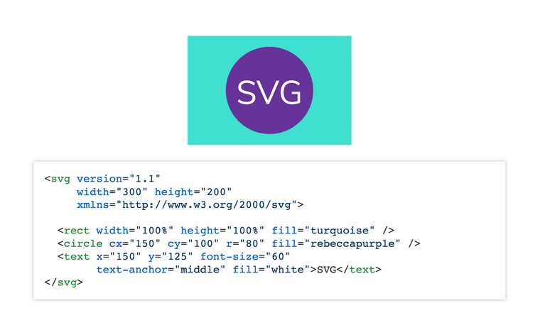
<circle> attributes to make the radius bigger or smaller, and I can change the position with the x and y attributes. If I made the entire SVG as big as a house, the lines would still be well defined with no pixelation.Provide multiple image size options with srcset Jump to heading
Once we have the right image format, the browser needs to display the right size image. At this point, we need to better understand DPR, or device pixel ratio. A DPR of 1 means that a 100px width block on the screen (display width) could only display a 100px width image (natural width). Now, nearly all mobile devices and some laptop and desktop monitors have a DPR of 2 or more. For a DPR of 2, we would need an image natural width of 200px to look good at a 100px display width. Using x-descriptors, this would be called a 2x image.

As a developer, we know the width we want to display the image, but we do not know the DPR of the user's device. This is where the srcset attribute can help us. The srcset provides a set of candidate files. The browser knows the user's device screen size and DPR, so it can then pick the best image to download based on the candidate files we give it.
In the following code sample, I'm giving the browser 2 candidate files - one is 300px wide and the other is 600px wide. I'm also supplying the src attribute as a fallback for very old browsers like IE11.
<img
  srcset="
    https://placekitten.com/300/200 300w,
    https://placekitten.com/600/400 600w
  "
  src="https://placekitten.com/300/200"
  alt="cute random kitten"
/>How would we do this with the image_tag? The markup is simpler than the manual HTML version (demo):
{{ section.settings.image |
 image_url: width: 600 |
image_tag: widths: '300, 600' }}In this example, the browser will assume the image display width is the same as the viewport width. Thus, a mobile phone user would likely download the 600px width image since most mobile phones now have 2x and higher DPR with a screen size of around 330px. This might be counterintuitive to what you would expect!
This is great, but most of the time, we don't display images as the full viewport width. The sizes attribute can help us give the browser better information…
Telling the browser how the image width changes with sizes Jump to heading
The sizes attribute tells the browser what the display width of the image will be at various viewport widths. It looks very similar to CSS but is not CSS:
<img
  src="https://placekitten.com/300/200"
  srcset="
    https://placekitten.com/300/200 300w,
    https://placekitten.com/600/400 600w,
    https://placekitten.com/900/500 900w
  "
  sizes="(max-width: 320px) 280px,
        (max-width: 640px) 580px,
        1000px"
  alt="cute random kitten"
/>
The reason we can't rely only on our CSS is that it takes more time for the browser to download and parse the CSS. We don't want to wait that long before downloading the correct image. So we provide CSS-like information in the HTML so the browser can make the best decision on which image size to download as quickly as possible.
Order matters! The first matching media condition is the one the browser uses. Always provide a final option without a media query to serve as the default if none of the previous ones match.
As a reminder, both srcset and sizes are providing hints to the browser. We're no longer telling the browser exactly which file to download but giving it information about how the image will display and a set of file candidates. The browser will make the final decision on which to download based on the user's screen size and device pixel ratio (DPR).
To add the sizes attribute to our Liquid image_tag, we need to add a sizes attribute to the parameters like so (demo):
{{ section.settings.image |
 image_url: width: 600 |
 image_tag:
   widths: '300, 600',
   sizes: '(min-width: 400px) 298px, 78.75vw',
   style: 'width: 300px' }}
The powerful <picture> tag Jump to heading
The <picture> tag is a newer HTML element that helps us overcome several complex issues:
- Serving fallback file types for older browsers
- Providing "art direction" to serve different images on mobile versus desktop
- Fixing oversized images on mobile devices due to high DPR screens
Browser fallbacks Jump to heading
Not all browsers support all image file formats. So how do we serve newer, better file formats while not breaking images for older browsers? The <picture> tag gives us even more power than an <img> when it comes to providing file candidates.
The <picture> tag wraps around an <img> element and then provides one or multiple <source> tags that can modify the srcset. In the following example, our fallback for older browsers is to serve the pug_life.jpg file. Newer browsers that understand the <picture> and <source> elements will instead read the attributes of the <source> elements to determine which srcset to use:
<picture>
  <source type="image/avif" srcset="pug_life.avif" />
  <source type="image/webp" srcset="pug_life.webp" />
  <img src="pug_life.jpg" alt="pug wearing a striped t-shirt like a boss" />
</picture>
In this case, we are providing the type attribute which refers to file type or format. If a browser can display AVIF images, it will use the pug_life.avif file. If not, it will check the remaining types and serve the first matching one. If it understands none of the types, it will serve whatever is in the <img> tag.
Currently, when using the image_url filter, the Shopify image CDN will automatically select the best file format based on the user's browser. So luckily we don't have to worry about using the <picture> tag to provide file format fallbacks. #winning!
Art direction Jump to heading
Art direction means a lot more in the design world, but when we use the term in the realm of web development and responsive images, we mean serving different files on different screen sizes. Maybe you want to show a zoomed-in and cropped version of an image on mobile or perhaps a different aspect ratio.
The <picture> tag can help us here because it can support <source> tags with different media attributes:
<picture>
  <source
    media="(min-width: 800px)"
    srcset="wide_800.jpg 800w, wide_1600.jpg 1600w"
  />
  <source
    media="(min-width: 400px)"
    srcset="narrow_400.jpg 400w, narrow_800.jpg 800w"
  />
  <img src="wide_800.jpg" alt="Woman with dog looking at Grand Canyon" />
</picture>
The logic is the same as with file type attributes. The first matching <source> element will be used. Again, order matters.
This is a more complex use case, so Liquid does not have a one-stop filter. Instead, we will wrap our image_tag in a <picture> element then use multiple image_url filters inside of the <source> to create the srcset manually (demo):
<picture>
 <source
   media="(max-width: 800px)"
   srcset="
     {{ section.settings.image2 | image_url: width: 300 }} 300w,
     {{ section.settings.image2 | image_url: width: 600 }} 600w,
     ">
 {{ section.settings.image |
   image_url: width: 600 |
   image_tag:
     widths: '300, 600',
     sizes: '(min-width: 400px) 298px, 78.75vw',
     style: 'width: 300px' }}
</picture>Fixing oversized mobile images Jump to heading
Another great use-case for the <picture> is to prevent the browser from downloading 3x and higher images on mobile. Many mobile screens have a DPR of 3 or higher. Thus, we can get in cases where we want a very large image on desktop, say 1500px wide, and that same size will be downloaded on mobile. 😳
The human eye cannot detect much difference between 2x and 3x images when viewed from 1 foot away, so serving a 3x image will result in much larger file sizes for no benefit.

One exception here may be product images that can be zoomed in (pinch in/out). Consider what type of product you're selling and what the image is showing. For example, with clothing, it might be important for a buyer to zoom in to see the fabric weave. Test which resolution looks good when zoomed in. At some point, you will get diminishing returns as the heavy file sizes will start to affect load performance and mobile data plans.
I would argue for most non-product images on your site, you probably don't need higher than 2x images. So how would we "DPR-cap" those images to 2x? For this example, I want my image to display 300px wide on mobile and 1000px wide on desktop. I only want to give 1x and 2x image options at each screen size (demo):
<picture>
 <source
   media="(max-width: 800px)"
   srcset="
     {{ section.settings.image | image_url: width: 300 }} 1x,
     {{ section.settings.image | image_url: width: 600 }} 2x,
     ">
 {{ section.settings.image |
   image_url: width: 2000 |
   image_tag:
     widths: '1000, 2000',
     sizes: '(min-width: 1000px) 760px, (min-width: 800px) calc(100vw - 380px), (min-width: 400px) 298px, 78.75vw',
     class: 'mobile-size-fix' }}
</picture>
The code is very similar to our art direction example, we're just using the same image for both sources. However, I've switched to x-descriptors for my mobile srcset to force the browser to only consider DPR. You could simplify this example more by dropping the 1x option in the srcset since most mobile phones have 2x and higher screens. If your customers use feature phones, it may be smart to keep the 1x versions.
Pitfalls to avoid Jump to heading
As Spider-Man's uncle once said, with great power comes great responsibility. We have these powerful tools, but we also need to know where the common pitfalls are.
First, don't go overboard on the srcset. When you have too many files in a srcset, you're reducing the chance that an end-user would see the performance benefits of caching, meaning longer network delays. If an image is not yet in an edge server, the request will need to go back to the origin server to request it. Even worse, if that image size has not yet been generated from the image API, the request will be further delayed. Cache expirations are not infinite so too many sizes in the srcset means a higher likelihood of longer requests. To add insult to injury, if your website gets lower traffic, you're even less likely to have all those image options in the CDN cache.
So if you shouldn't have too many, which sizes should you use? Most research shows that a human with 20/20 vision cannot distinguish greatly between 2x and higher resolution images when 1-2 feet away from a screen. Thus, you're safe in most cases only providing 1x and 2x sizes. The number of possibilities increase as screen size changes, but you do not have to provide every single variant. For example, the difference between a 600px and 700px image is not great enough to warrant providing both sizes.
Finally, don't upload low-resolution images! When using image_url, the API will automatically resize an image, but it cannot give you a larger image than the original. You want a high-resolution starting point. In other words, if you ask for an image that is 1000px wide but the original was only 500px wide, your image's URL will look like it is 1000px wide but the image itself will only be 500px wide.
Conclusion Jump to heading
In this article, we learned how to use Liquid's image_url and image_tag filters to generate responsive images for our websites.
The image_url filter generates the right size image files with the best formats. It will automatically provide more modern formats to browsers that support them without breaking older browser behavior. It also puts those images in the Shopify CDN for better load performance.
The image_tag filter helps us generate all the right markup we need to serve responsive images, including srcset, sizes, and many other attributes.
We also learned how to overcome more difficult use cases like art direction and oversized images on mobile using the <picture> tag.
When it comes to pitfalls, don't provide too many widths to a srcset or you'll lose a lot of caching benefits. Also, don't upload low-resolution images. Use the largest size possible to ensure that when you need a larger image, you can generate it.
Now that you know how to create responsive images, consider learning about how to load images in the best way to optimize for site loading speed in our next article, Optimize images for performance.
Header photo by Soragrit Wongsa on Unsplash.